How to add a shadow effect to a PNG image using CSS
Are you looking to add a touch of elegance to your PNG images? | How to add a shadow effect to a PNG image using CSS
Today, I’ll show you how to create a stunning shadow effect that will make your images pop. With just a few simple steps, you’ll be able to add depth and dimension to your images, making them stand out from the crowd.
- Adding a shadow effect to a PNG image can be done using the
filter: drop-shadow()property in CSS. - This property is applied to the image element and takes four values:
x-offset,y-offset,blur-radius, andcolor. - The
x-offsetandy-offsetvalues specify the horizontal and vertical distance of the shadow from the image, respectively. - The
blur-radiusvalue determines the amount of blur applied to the shadow, while thecolorvalue specifies the color of the shadow.
Adding a Shadow Effect to a PNG image using CSS
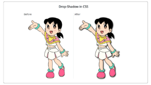
Here’s an example of how to use the filter: drop-shadow() property to a PNG image:
Without Shadow / With Shadow

img {
filter: drop-shadow(5px 5px 5px #222);
}
This will add a shadow effect to the image with a horizontal offset of 5 pixels, a vertical offset of 5 pixels, a blur radius of 5 pixels, and a shadow color of #222.
More Complex Shadow Effect
To create a more complex shadow effect, you can adjust the values of the x-offset, y-offset, blur-radius, and color properties. For example, to create a shadow effect that appears to be coming from the bottom right corner of the image, you can use the following CSS:

img {
filter: drop-shadow(10px 10px 10px rgba(0, 0, 0, 0.5));
}
This will add a shadow effect to the image with a horizontal offset of 10 pixels, a vertical offset of 10 pixels, a blur radius of 10 pixels, and a shadow color of rgba(0, 0, 0, 0.5). For More Information Read CSS filter Property.
Today, you have successfully learned Something New in CSS.” I hope this information is useful. Please feel free to ask me anything else you need help with..

