Create High-Fidelity Designs and Prototypes in Figma Week 2 Ans
In this article i am gone to share Coursera Course Create High-Fidelity Designs and Prototypes in Figma Week 2 Quiz Answer with you..
Create High-Fidelity Designs and Prototypes in Figma Week 2 Quiz Answers
Visit this link: Create High-Fidelity Designs and Prototypes in Figma Week 1 Quiz Answer
Test your knowledge on emphasis and hierarchy
Question 1)
A designer develops a website for a local bakery and wants to direct users to its online ordering page. They add a bright orange “Place an Order” button to the homepage with a white background. What visual weight variable did the designer incorporate in the app?
- Motion
- Image
- Color
- Size
Question 2)
When deciding what to emphasize in your design, what key questions should you ask? Select all that apply.
- What are the user’s goals?
- Where should I place the secondary sections?
- Where do I want to draw the user’s attention?
- How frequently should I include the emphasis?
Question 3)
Hierarchy is important in UX design because it makes clear to the user _____ and what action to take.
- what needs the least attention
- where to focus first
- what is least important
- where to find the homepage
Question 4)
Which of the following is an example of hierarchy?
- A website’s homepage adds bold color to the heading text
- A website that features a consistent color scheme
- A website’s homepage that opens up with a large image at the top and, as users scroll down the page, the other like images gradually become smaller.
- A website’s navigation bar alternates between different colors for each subject
Test your knowledge on scale and proportion
Question 1)
Which visual design principle is used to explain the size relationship between a given element and the other elements in a design?
- Proportion
- Containment
- Scale
- Emphasis
Question 2)
If a designer reviews the navigation bar on a mockup and considers replacing one of the five icons, which visual design elements will best help them keep the design consistent and balanced? Select all that apply.
- Hierarchy
- Proportion
- Scale
- Emphasis
Question 3)
Fill in the blank: If one element in your proportionate design increases in size, then the other elements should _____.
- stay the same size so the original elements stay proportionate
- also increase in size at the same rate in order to remain proportionate
- shrink in size to place emphasis on the resized element
- move in the design to prevent any potential crowding
Test your knowledge on unity and variety
Question 1)
A design team builds a prototype for a local farm’s website. They incorporate a consistent color scheme, complementary fonts, and consistent spacing in the design. What visual design principle is this an example of?
- Proportion
- Unity
- Hierarchy
- Variety
Question 2)
If used effectively, variety can create visual interest and break up monotony. Which example is the best use of variety?
- Apply bold text to all content on a webpage
- Apply an orange background to normal weather events on a weather app
- Use different colors from the brand’s color palette in a website’s background
- Add emojis to the end of each sentence in a social media post
Test your knowledge of Gestalt Principles
Question 1)
Which Gestalt Principle states that elements that are close together appear to be more related compared to elements spaced farther apart?
- Common region
- Proximity
- Similarity
Question 2)
Consider the following scenario:
Emile is creating an app that lets people rent bicycles. Users can check in, check out, and pay for their rental with it. Emile wants users to associate the brand color—vermillion red—with the check-out process by indicating successful progress with check marks in this color. Emile wants to make buttons, such as “Next” and “Complete Order” to follow the same theme. Which Gestalt principle is this comparable to?
- Similarity
- Common region
- Proximity
- Visual balance
Question 3)
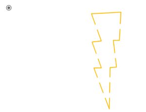
The closure principle describes that when a user looks at an incomplete object, they subconsciously complete the image in their mind to see the whole, completed object. Which of the following graphics best depicts the closure principle?
Question 4)
A design team wants to add a new, secret page on their app that only observant users will be able to find. They only want to change one element of the current design. Which visual design strategy would best allow them to adjust just one element of the current design and draw visual attention to the secret page?
- Proximity
- Symmetry
- Asymmetry
- Common region


