In this article, I will show you how to create a stunning Expanding Card Gallery with Tailwind CSS & Alpine.js. You’re going to love how it looks — and you’ll definitely learn something new about Alpine.js along the way.
Table of Contents
Introduction
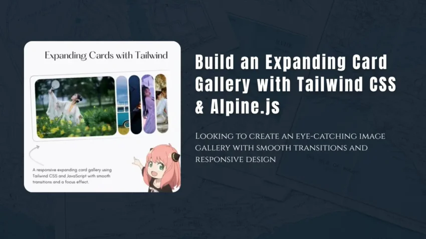
Looking to create an eye-catching image gallery with smooth transitions and responsive design? In this tutorial, we’ll show you how to build a beautiful expanding card gallery using Tailwind CSS and Alpine.js—without writing complex JavaScript.
This method is perfect for landing pages, portfolios, or any project where you want a sleek, interactive card layout that works on both desktop and mobile devices.
Technologies Used
- Tailwind CSS – For utility-first styling and responsiveness
- Flowbite – Optional UI kit based on Tailwind (included in case you want to add buttons or modals later)
- Alpine.js – A lightweight JavaScript framework for reactive behavior
- Pixabay – Used for image links.
Features of This Expanding Card Gallery
- Responsive layout with fluid resizing
- Smooth transition animations
- Click to expand and focus on a specific card
- Only the selected card title is visible
- Optimized for mobile and desktop
How It Works
This gallery consists of multiple image cards placed in a horizontal flex container. Using Alpine.js, we track which card is selected and adjust the flex-grow property dynamically. The selected card expands, while others shrink to a minimal width.
Demo / Expanding Card Gallery with Tailwind CSS & Alpine.js
Note: For the best experience, try opening this in a new tab — the full UI might not display properly inside an iframe.
https://niyander.com/projects/components/expanding-cards.html
Full HTML Code Example
<!doctype html>
<html lang="en" class="scroll-smooth">
  <head>
    <meta charset="utf-8">
    <meta name="viewport" content="width=device-width, initial-scale=1">
    <title>Expanding Cards with Alpine.js</title>
    <script src="https://cdn.tailwindcss.com"></script>
    <script src="https://unpkg.com/alpinejs" defer></script>
    <link href="https://cdn.jsdelivr.net/npm/[email protected]/dist/flowbite.min.css" rel="stylesheet"/>
    <link href="https://fonts.cdnfonts.com/css/google-sans" rel="stylesheet">
    <style>
      * {
        font-family: 'Product Sans Light', sans-serif;
      }
      .rounded-5xl {
        border-radius: 4rem;
      }
    </style>
  </head>
  <body class="bg-gray-900">
    <div class="container m-auto h-screen p-5">
      <h1 class="text-center mt-4 mb-2 text-3xl text-white">Expanding Cards with Alpine.js</h1>
      <p class="text-center mb-10 text-lg text-white">
        A responsive expanding card gallery using Tailwind CSS and Alpine.js with smooth transitions and a focus effect.
      </p>

      <!-- Alpine.js Component -->
      <div
        class="flex items-center justify-center"
        x-data="{
          selected: 0,
          cards: [
            { title: 'Girl In Garden', image: 'https://cdn.pixabay.com/photo/2021/07/26/01/47/woman-6493189_1280.jpg' },
            { title: 'Couple', image: 'https://cdn.pixabay.com/photo/2019/06/25/04/01/wedding-4297343_1280.jpg' },
            { title: 'Boat Night', image: 'https://cdn.pixabay.com/photo/2024/12/09/16/22/boat-9255590_1280.jpg' },
            { title: 'Beautiful Girl', image: 'https://cdn.pixabay.com/photo/2020/07/30/10/29/woman-5450043_1280.jpg' },
            { title: 'Love', image: 'https://cdn.pixabay.com/photo/2019/11/10/11/13/couple-4615557_1280.jpg' }
          ]
        }"
      >
        <div class="flex w-[90vw] overflow-hidden transition-all duration-700 ease-in-out">
          <!-- Cards -->
          <template x-for="(card, index) in cards" :key="index">
            <div
              class="card relative h-[70vh] m-2 rounded-5xl bg-cover bg-center bg-no-repeat cursor-pointer transition-[flex] duration-700 ease-in-out flex items-end p-5 text-white"
              :class="selected === index ? 'flex-[5]' : 'flex-[0.5] hidden md:flex md:flex-[0.5]'"
              :style="`background-image: url(${card.image})`"
              @click="selected = index"
              x-show="index < 3 || (index >= 3 && window.innerWidth >= 768)"
            >
              <h3
                class="text-xl transition-opacity duration-300 ease-in delay-400 mb-6 ms-6"
                :class="selected === index ? 'opacity-100' : 'opacity-0'"
                x-text="card.title"
              ></h3>
            </div>
          </template>
        </div>
      </div>
    </div>
  </body>
</html>
You can also read these article: How to Create a Countdown Timer with Alpine.js
Conclusion
With just Tailwind CSS and Alpine.js, you can build powerful, responsive, and interactive UI components—like this expanding card gallery—without the need for complex frameworks or writing mountains of JavaScript. This lightweight, elegant solution gives you full control over interactivity while keeping your codebase clean and maintainable.
Whether you’re a beginner exploring frontend development or a seasoned developer looking for fast, reliable ways to build engaging interfaces, this approach is incredibly flexible. You can easily extend it to include features like modals, dynamic data loading, swipe gestures, or even integrate with APIs to pull in live content.
Give it a try in your next project—and make your galleries pop!