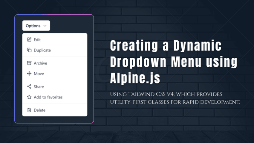
In this article, I will explain how to create a Dropdown Menu using Alpine.js. Dropdown menus are essential UI components that enhance user experience by organizing actions and options in a compact, accessible format.
- For the UI design and styling, I am using Tailwind CSS v4, which provides utility-first classes for rapid development.
- For the icons, I have chosen Lucide Icons, a versatile and lightweight icon library with a wide range of options.
- For adding interactive functionality and managing state, I am utilizing Alpine.js, a minimal JavaScript framework designed for declarative UI behavior.
Why Lucide Icons instead of SVGs?
Some might ask why I prefer Lucide Icons over regular SVGs. The reason is simple—I like clean code. Lucide Icons take up significantly less space in the HTML file compared to inline SVGs, which can become bulky. Additionally, Lucide Icons offer a vast collection of icons, some of which may not be available as standalone SVGs.
Preview: Dropdown Menu Type 1
Preview: Dropdown Menu Type 2
Preview: Dropdown Menu Type 3
Download all Dropdown components below:
Using this link, you can download the Dropdown Menu files. Each file contains a different type, allowing you to easily choose the one that best suits your project. You can download and use them as needed, and even modify them to fit your requirements.
Dropdown toggle button code
<script>
    document.addEventListener("DOMContentLoaded", () => {
        lucide.createIcons();
    });

    document.addEventListener("alpine:init", () => {
        Alpine.data("dropdown", () => ({
            open: false,
            toggle() {
                this.open = !this.open;
            }
        }));
    });
</script>
Understanding the Code
- Alpine.js for Interactivity: The
x-data="dropdown"directive initializes Alpine.js data, while thex-show="open"directive toggles the menu. - Tailwind CSS for Styling: The menu uses utility classes to style buttons, lists, and hover effects.
- Lucide Icons for Graphics: The
<i data-lucide="icon-name"></i>elements fetch icons dynamically.
Dropdown Menu using Alpine.js Full Source Code
<!DOCTYPE html>
<html lang="en">
<head>
    <meta charset="UTF-8">
    <meta name="viewport" content="width=device-width, initial-scale=1.0">
    <script src="https://cdn.jsdelivr.net/npm/[email protected]/dist/cdn.min.js" defer></script>
    <script src="https://unpkg.com/lucide@latest/dist/umd/lucide.min.js"></script>
    <script src="https://cdn.tailwindcss.com"></script>

    <script>
        document.addEventListener("DOMContentLoaded", () => {
            lucide.createIcons();
        });

        document.addEventListener("alpine:init", () => {
            Alpine.data("dropdown", () => ({
                open: false,
                toggle() {
                    this.open = !this.open;
                }
            }));
        });
    </script>

    <title>Dropdown Menu</title>
</head>
<body class="flex justify-center bg-gray-200 p-6">
    <div x-data="dropdown()" class="relative inline-block text-left">
        <button @click="toggle" type="button" class="inline-flex w-full justify-center gap-x-1.5 rounded-md bg-white px-3 py-2 text-sm font-semibold text-gray-900 ring-1 shadow-xs ring-gray-300 ring-inset hover:bg-gray-50">
            Options
            <svg class="-mr-1 size-5 text-gray-400" viewBox="0 0 20 20" fill="currentColor">
                <path fill-rule="evenodd" d="M5.22 8.22a.75.75 0 0 1 1.06 0L10 11.94l3.72-3.72a.75.75 0 1 1 1.06 1.06l-4.25 4.25a.75.75 0 0 1-1.06 0L5.22 9.28a.75.75 0 0 1 0-1.06Z" clip-rule="evenodd" />
            </svg>
        </button>

        <div x-show="open" @click.outside="open = false" class="absolute right-0 z-10 mt-2 w-56 origin-top-right divide-y divide-gray-100 rounded-md bg-white ring-1 shadow-lg ring-black/5" role="menu">
            <div class="py-1">
                <a href="#" class="flex items-center px-4 py-2 text-sm text-gray-700 hover:bg-gray-100" role="menuitem">
                    <i data-lucide="edit" class="w-4 h-4 mr-2"></i>Edit
                </a>
                <a href="#" class="flex items-center px-4 py-2 text-sm text-gray-700 hover:bg-gray-100" role="menuitem">
                    <i data-lucide="copy" class="w-4 h-4 mr-2"></i>Duplicate
                </a>
            </div>
            <div class="py-1">
                <a href="#" class="flex items-center px-4 py-2 text-sm text-gray-700 hover:bg-gray-100" role="menuitem">
                    <i data-lucide="archive" class="w-4 h-4 mr-2"></i>Archive
                </a>
                <a href="#" class="flex items-center px-4 py-2 text-sm text-gray-700 hover:bg-gray-100" role="menuitem">
                    <i data-lucide="move" class="w-4 h-4 mr-2"></i>Move
                </a>
            </div>
            <div class="py-1">
                <a href="#" class="flex items-center px-4 py-2 text-sm text-gray-700 hover:bg-gray-100" role="menuitem">
                    <i data-lucide="share-2" class="w-4 h-4 mr-2"></i>Share
                </a>
                <a href="#" class="flex items-center px-4 py-2 text-sm text-gray-700 hover:bg-gray-100" role="menuitem">
                    <i data-lucide="star" class="w-4 h-4 mr-2"></i>Add to favorites
                </a>
            </div>
            <div class="py-1">
                <a href="#" class="flex items-center px-4 py-2 text-sm text-gray-700 hover:bg-gray-100" role="menuitem">
                    <i data-lucide="trash-2" class="w-4 h-4 mr-2"></i>Delete
                </a>
            </div>
        </div>
    </div>
</body>
</html>
Customization Ideas
- Dynamic Content: Replace static links with data fetched from an API.
- Animations: Add x-transition from Alpine.js for smooth open/close effects.
- Theming: Tweak Tailwind classes for a dark mode or branded colors.
You can also read these article: How to Create a Countdown Timer with Alpine.js
Conclusion
This dropdown menu is lightweight, flexible, and simple to use. It uses Alpine.js for managing states, Tailwind CSS for styling, and Lucide Icons for icons. You can build a clean, modern menu with just a few lines of code. Try modifying it to fit your project’s needs.
